Graphic strategies
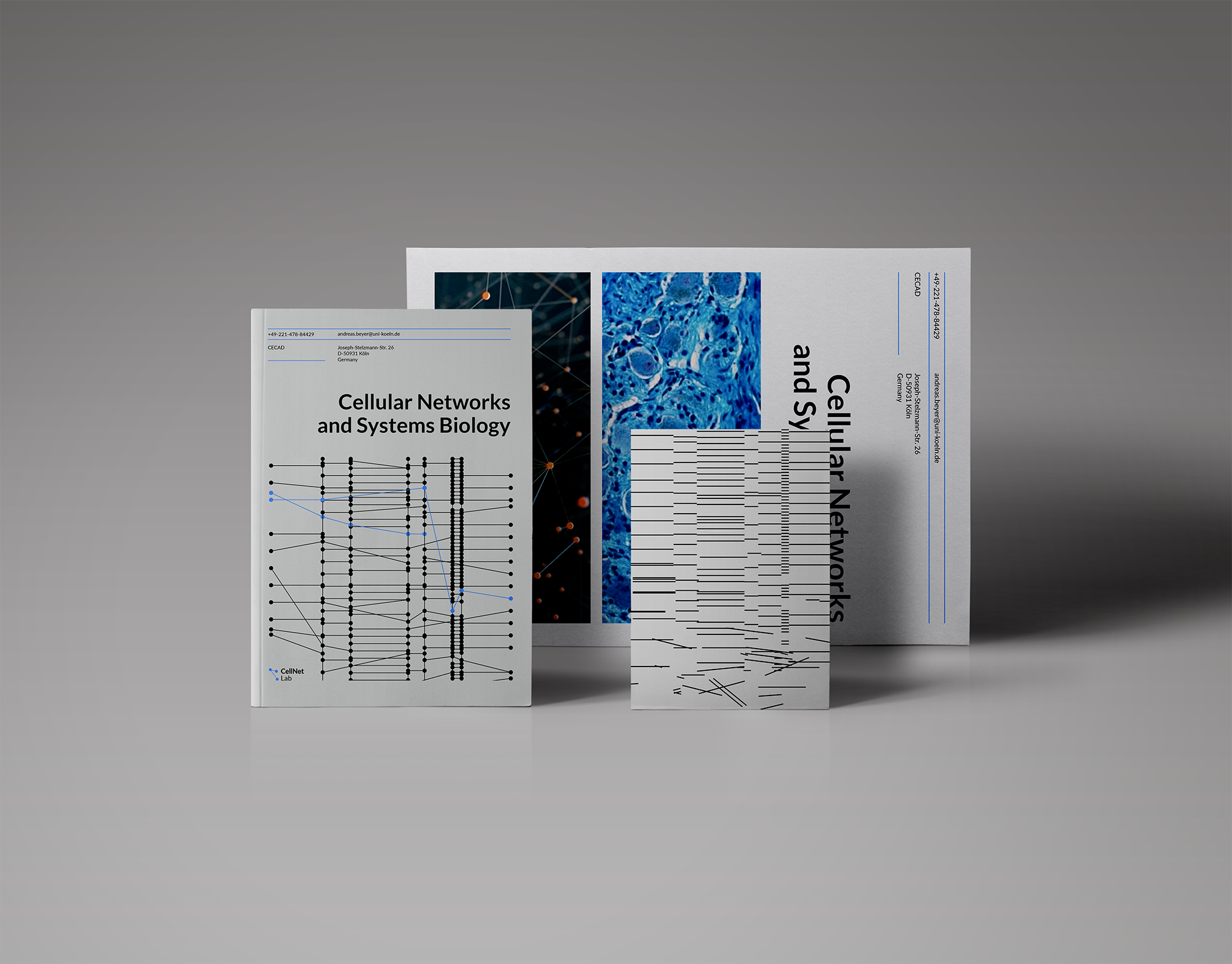
There are two different functions. The first one is to illustrate a lab work with some valuable graphic content: by graphs, stats, and data, hi-res unique renders and shots, etc., but images from stocks also could be used to show the main line of work. You can see some preview gettyimages on this layout, but also you can see that all of them despite the quality are using some cliches about a lab- and biology work.
A specific image connected with your particular study will always be more valuable for a professional reader, and for a regular less-involved in the topic user, a more common stock photo is enough.
The second function is to create a minimalistic visual identity to use in some internal papers and to mark all lab content, to make it recognizable. Because your primary user is very specific and there is no goal to do a broad popularization of science, basic typography rules, color scheme, and some simple patterns are pretty enough to make a full identity system.
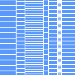
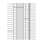
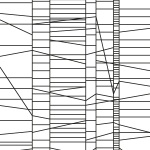
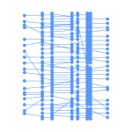
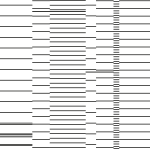
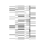
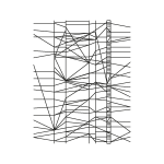
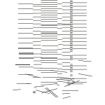
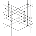
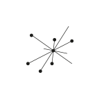
You can see below pattern studies, all based on a typical view on a DNA sequencing data and networks visualization.
All of them are line-based, but one group is close to a gradient-imitation and another one is more strict and linear. Here is a visualization in layouts:


Logo function
Given the narrow specialization of the lab, the logo here works differently than in the retail and the mass market. The main recognizable element of the lab is its name and a graphic mark here is a secondary detail to support the name. Also, it’s important that iconic images for networks, labs and science topic are generally very obvious (except a situation when a study is connected with a very specific and unique graphic element), so in this case, a logo mark could and should be simple and clear, but not necessarily static.
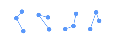
Here is a simple mark that is based on three points and connections between them, so there are numerous of variations of this mark (and all of them are universal) and a possibility to animate it.
